Welcome to the IE Hall of Fame: A Tour Through the Browser's Most Unforgettable Moments
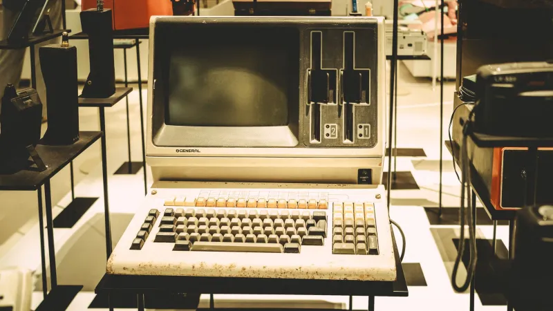
Please note: This museum is best viewed in Internet Explorer 6. If you are not using Internet Explorer 6, please download Internet Explorer 6. We cannot guarantee your experience in any other browser. The gift shop is also broken in Firefox.
Welcome, visitors, to the Internet Explorer Hall of Fame — a celebration of the browser that shipped with every copy of Windows for nearly three decades and somehow still managed to feel like it was running on borrowed time. Our curators have assembled the finest collection of IE's most memorable visual elements, UI decisions, and error messages for your nostalgic enjoyment.
Please keep your arms inside the viewport at all times. The layout may shift unexpectedly.
Exhibit A: The Spinning 'e' — An Icon Examined
No artifact in our collection commands more immediate recognition than the Internet Explorer logo: that blue lowercase "e" with the yellow orbital ring swept diagonally across it, suggesting motion, progress, and a vague sense that the internet was something you could spin your way into.
The logo evolved considerably over IE's lifetime. The original designs were almost charmingly literal — a globe, a network, something that said "we are connecting you to the world wide web" with the graphic design subtlety of a 1995 PowerPoint presentation. By the time IE reached its peak versions, the logo had been refined into something genuinely iconic — simple enough to recognize at 16x16 pixels in a taskbar, distinctive enough to appear on merchandise, tattoos, and ironic t-shirts worn by developers who had complicated feelings about their past.
Modern comparison: Today's Edge logo — a stylized wave in blue and green — is objectively prettier and communicates exactly nothing about what the browser does. The 'e' at least tried to mean something. Nostalgia points to IE.
Exhibit B: The Loading Bar — Analog Anxiety in a Digital World
Before the spinning favicon became the universal symbol of "please wait, the internet is thinking," Internet Explorer had its own loading indicator: a progress bar at the bottom of the window that moved with all the confidence of someone parallel parking for the first time.
The bar would surge forward, suggesting imminent completion, then stop. Then creep. Then surge again. It bore almost no relationship to actual page load progress, which made it less of an informational tool and more of an emotional experience. You watched it the way you watched a slot machine — with desperate, irrational hope.
The animated logo in the top-right corner — a small Windows flag or starfield animation, depending on the version — spun continuously while loading, like a hypnotist's watch designed to keep you calm while the page took forty-five seconds to render a table.
Modern comparison: Chrome's circular loading spinner is accurate, minimal, and boring. It doesn't make you feel anything. The IE progress bar made you feel everything.
Exhibit C: The Friendly Error Messages (They Were Not Friendly)
Perhaps no feature of Internet Explorer is more fondly remembered — or more aggressively mocked — than its error messages. Microsoft, in a misguided attempt to humanize the experience of catastrophic failure, introduced "friendly HTTP error messages" in IE5, which replaced the server's actual error text with Microsoft's own, softer explanations.
404 errors became "The page cannot be found" with a helpful list of suggestions that assumed the user had no idea how URLs worked. Server errors became gentle explanations that "the page cannot be displayed," as though the internet had simply decided not to cooperate today and everyone should be patient about it.
The actual technical information — the status codes, the server responses, the data a developer might need to diagnose a problem — was hidden by default. You had to go into Internet Options and uncheck "Show friendly HTTP error messages" to see what was actually happening. Which is to say, IE's default behavior was to hide the truth from you in the name of politeness.
Modern comparison: Chrome's error pages have personality — the dinosaur game on the "No internet" page has been played by approximately every human alive. But they also show you the actual error code. Progress.
Exhibit D: The Script Error Dialog — A Classic in Interactive Theater
Ah. The dialog. "A Runtime Error has occurred. Do you wish to Debug? Line: 47. Error: Object expected."
For the vast majority of internet users in the early 2000s, this dialog appeared with startling regularity and communicated absolutely nothing actionable. "Object expected" — by whom? For what purpose? What object? The dialog offered two options: "Yes" (open the script debugger, which most users didn't have installed) or "No" (dismiss the error and hope for the best).
Users clicked "No" millions of times per day, worldwide, for years. The dialog became so familiar that people developed a Pavlovian response — the moment the box appeared, the hand moved to the mouse, the cursor found "No," and the click happened before conscious thought could intervene. It was muscle memory born of repetition and mild despair.
Modern comparison: Chrome's DevTools console quietly logs JavaScript errors where only developers will see them. Nobody's grandmother is clicking through script error dialogs anymore. This is unambiguously better, but we've lost a shared cultural experience.
Exhibit E: The Crash — In All Its Blue-Screened Glory
No tour of the IE Hall of Fame would be complete without acknowledging the crashes. Internet Explorer, particularly in its earlier incarnations, had a relationship with stability that could generously be described as "aspirational." Tabs didn't exist in the early versions, which meant that when IE crashed, it took everything with it — all your windows, all your work, all your half-written emails — in one spectacular, total collapse.
The recovery experience was equally memorable. A dialog would appear offering to send an error report to Microsoft. Users clicked "Send Error Report" or "Don't Send" with approximately equal frequency and zero understanding of what either option accomplished. Microsoft presumably received billions of these reports. The crashes continued.
When IE eventually introduced tab isolation (much later than competitors), it was treated as a major feature — the ability to crash one tab without destroying everything else. The bar was genuinely that low.
Modern comparison: Modern browsers crash individual tabs silently, recover sessions automatically, and generally treat stability as a baseline expectation rather than an achievement. We have come so far.
The Gift Shop
As you exit through the gift shop — which renders correctly in all modern browsers, because we learned our lesson — we hope this tour has given you a renewed appreciation for how far web browsers have come, and a gentle, bittersweet fondness for the one that made the journey so entertainingly difficult.
Internet Explorer was many things: frustrating, inconsistent, occasionally maddening in ways that felt almost personal. But it was also the browser that most Americans used to first experience the internet. It was there for the first Google searches, the first online shopping carts, the first awkward MySpace profiles.
For better or worse, it was the window through which a generation first saw the web. And that spinning 'e' — that optimistic, orbital, perpetually loading 'e' — deserves its place in the hall of fame.
Thank you for visiting. The exit is through the pop-up ad. We apologize. We can't figure out how to close it.